# Events
Event Analytics is a powerful and flexible model that allows you to filter or group event data, calculate the aggregated metrics of specific user behaviors over a period, and present data results in various types of tables or charts with simple operations.
By Event Analysis, you can get quick answers to the following questions:
- What are the trends in the number of players and devices logging into the game per day over the past 30 days?
- What is the payment ratio of new users on the day of registration?
- For users from Shanghai, what is the trend in payment amount per user in the last month?
# How to configure analysis metrics quickly

When using the Event Analysis model, the first step is to select the specific behavior to be analyzed. You can select a preset event, a custom event or a virtual event.
When you select an event, by default, the frequency of events, i.e. how many times a specific event (e.g. payment, app launch) has occurred, will be counted, and you can View Event Details to see the detailed information about the event. You can also choose other preset calculation methods, such as the number of triggering users or the number of times per user, or statistics based on an event property. For the logic behind calculation methods, please see the Calculation Methods.
Event Analysis also supports "Formula" to get ratio-like metrics, such as payment ratio, average revenue per user (ARPU), etc. The four basic arithmetic operations are supported. You can also switch to "Formulas" from "Events", or switch to "Events" from "Formulas".
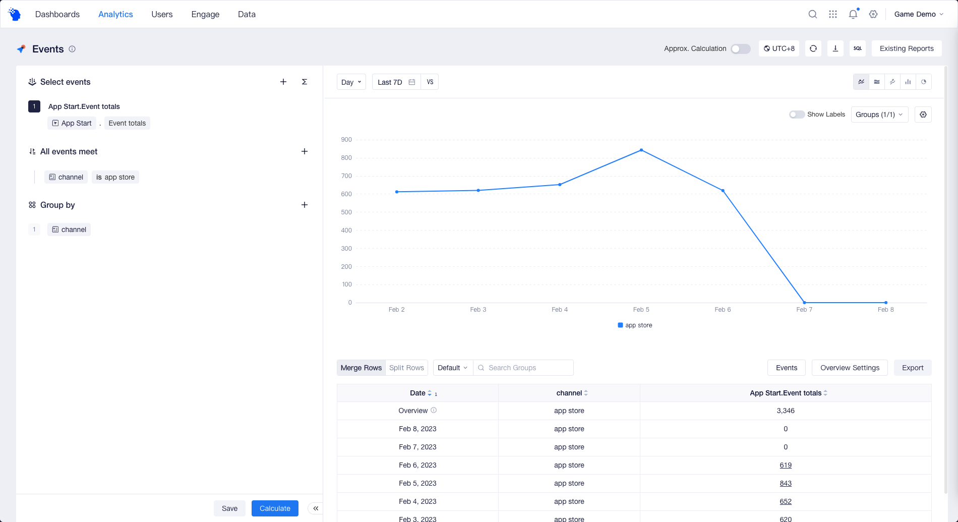
If you want to exclude unwanted data, or screen out events or users that satisfy certain characteristics for analysis, such as counting only payments from app store, you can use Data Filtering.
If you want to compare the data from different channel such as app store, Google Play, you can use Group by.
After the configuration, you can click the "Calculate" button to see the data results.
# Visualization of Data Results
Event Analysis supports various types of visualizations. You can choose the most appropriate chart type to analyze your data results. You can also customize table display if you get used to viewing specific values in tables.
- Line
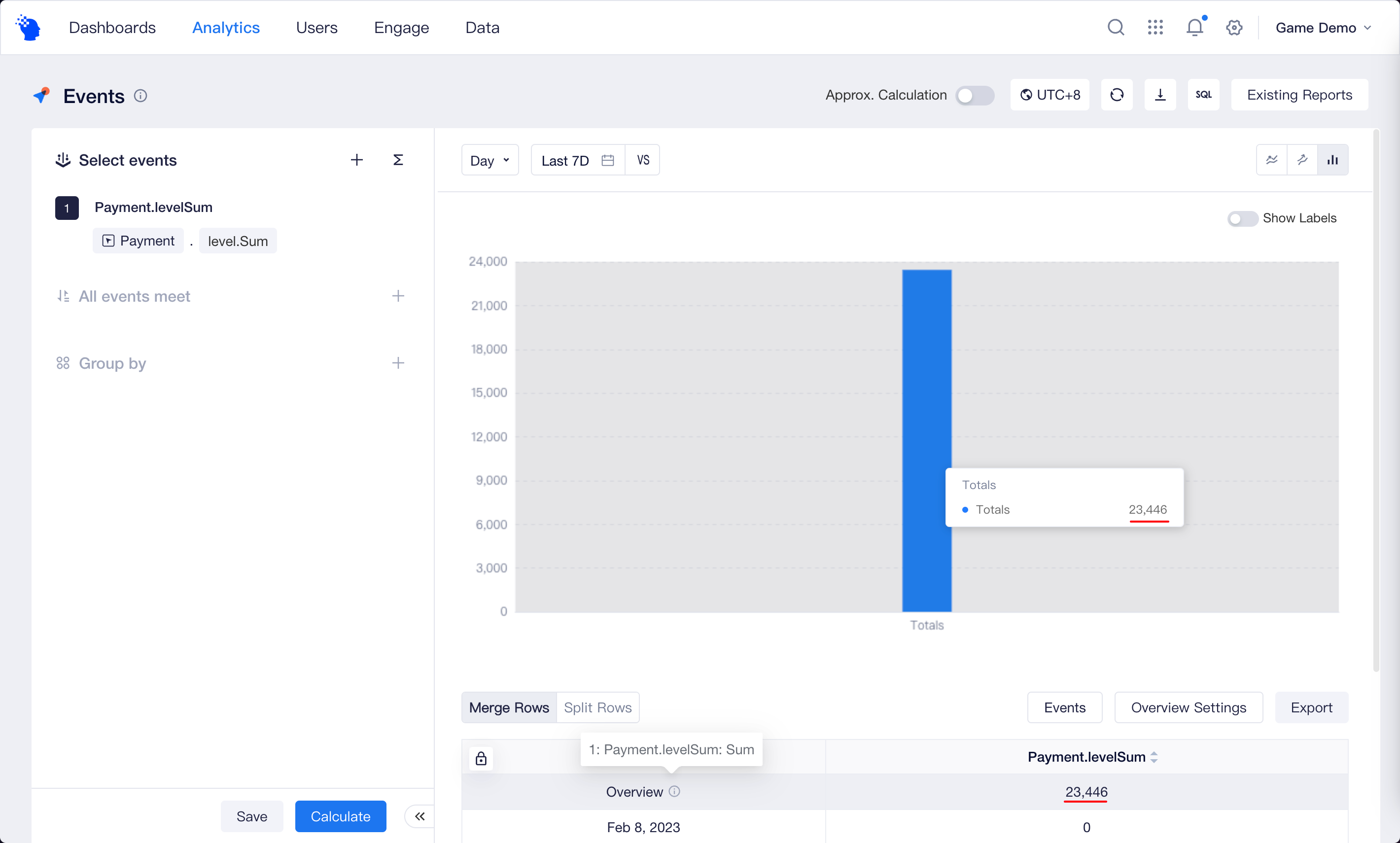
When you select a time granularity other than "Total", Event Analysis will display a trend chart by default to help you learn how the metrics changed over time.

The performance of each analytic metric of each subgroup corresponds to a line on the chart, and you can also switch to bar chart or stacked bar chart. If the analysis metric data vary greatly in magnitude, you can obtain the most suitable display effect by configuring metrics of different magnitudes and displaying them on the main axis or sub-axis.

- Cumulative
When you select a time granularity other than "Total", in addition to trend chart, you can view the cumulative result of the metrics over time through cumulative chart, where the value at each point is the sum of the values up to the point.
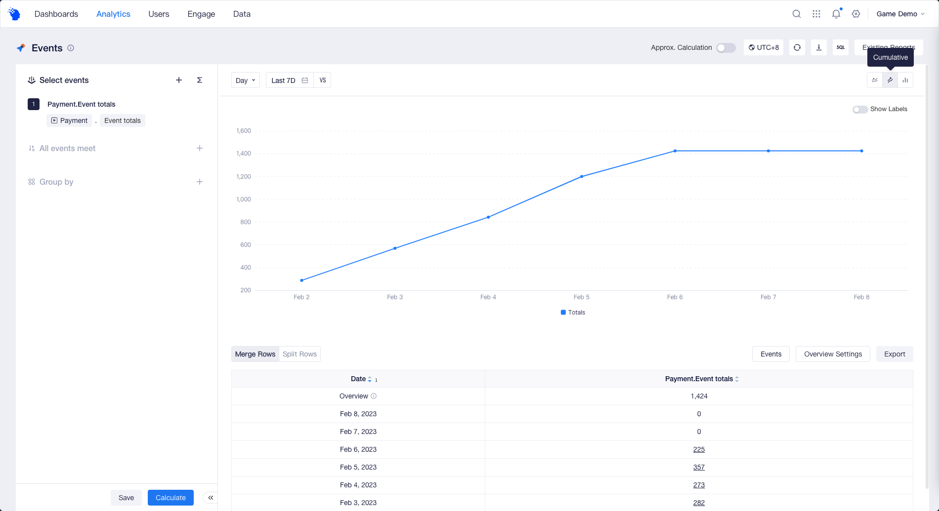
Note: If you choose Uniques, or Deduplication, Maximum,N-th Percentile, etc. for Calculation Method, cumulative chart may not be suitable for displaying results.
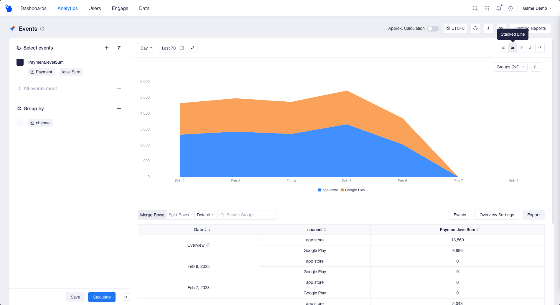
- Stacked Line
If you have configured multiple analysis metrics, or if "Group by" has more than one group value, you can switch to Stacked Line.
- Distribution
When you select "Total" for time granularity, TE will display a distribution chart by default to help you visually compare the results of different metrics or subgroups over the selected time frame.
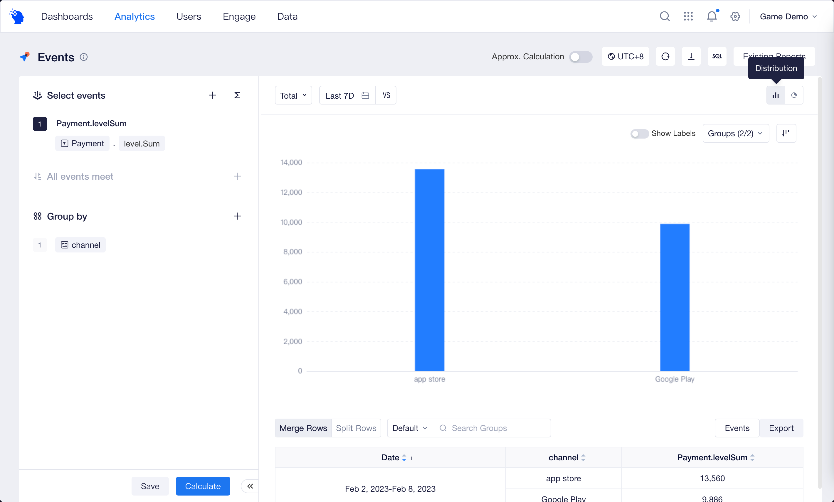
If you choose a time granularity other than "Total", you can also switch to distribution chart, where the data on the chart is a simple sum of the data at each date, i.e., the "Totals" in the table’s Overview Settings.
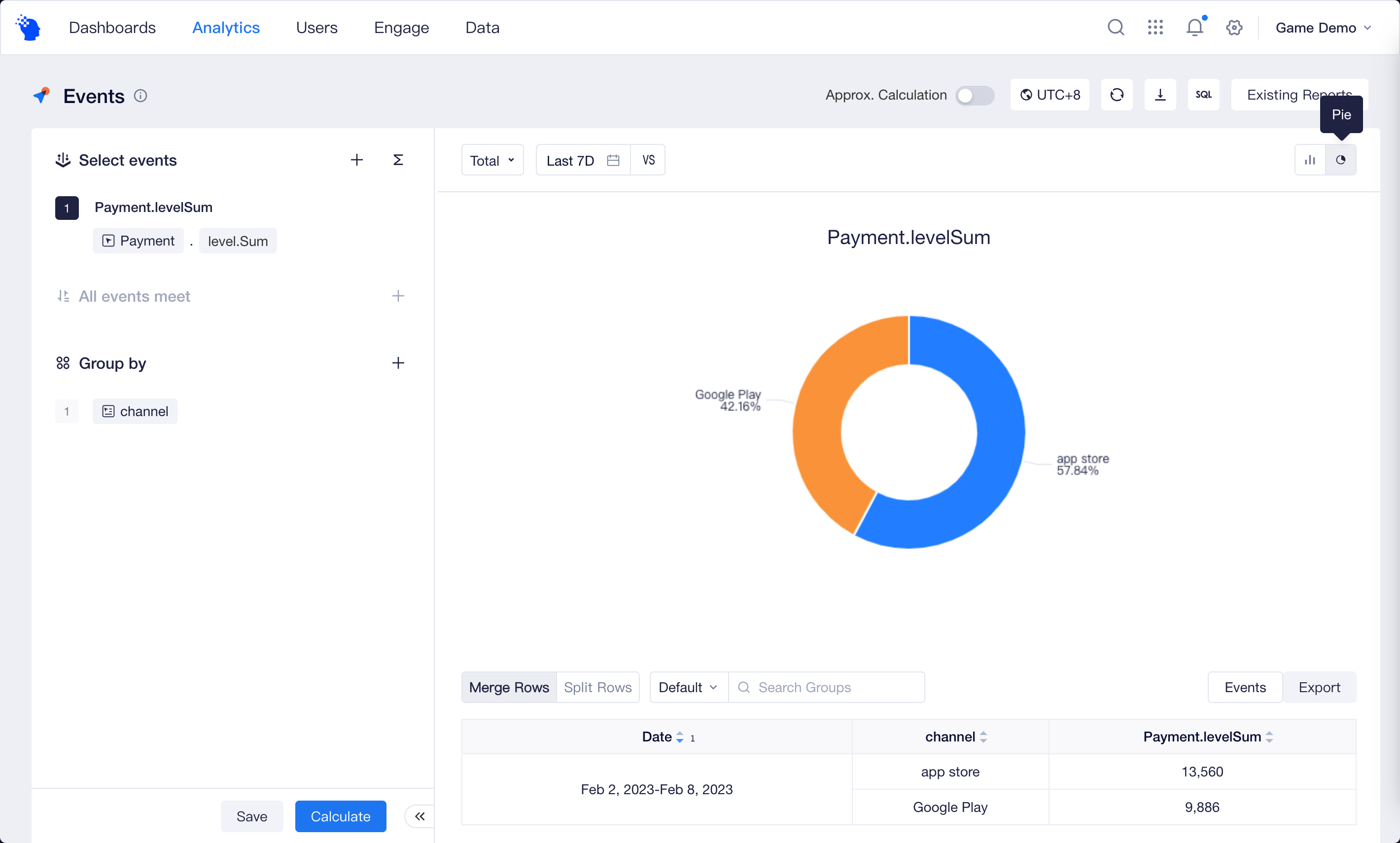
- Pie
If you want to see the percentage of subgroups visually, you can switch to "Pie".
# Advanced Features
In addition to what has been described above, you can use the advanced features to answer more complex questions.
- What about the number of new users this month when compared with last month’s performance? Compare data performances in multi-dates
- What was the share of each media source in daily revenue last month? Compare shares of different dimensions
- Was there any change in user stickiness metric "DAU/MAU ratio" in the past 30 days? Extend Date Range.